Cartography & Data Visualization
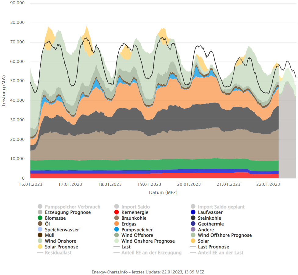
Energy-Charts
Created by the "Frauenhofer-Institut für Solare Energiesysteme ISE"
You can see the current data here: Energy-Charts.info
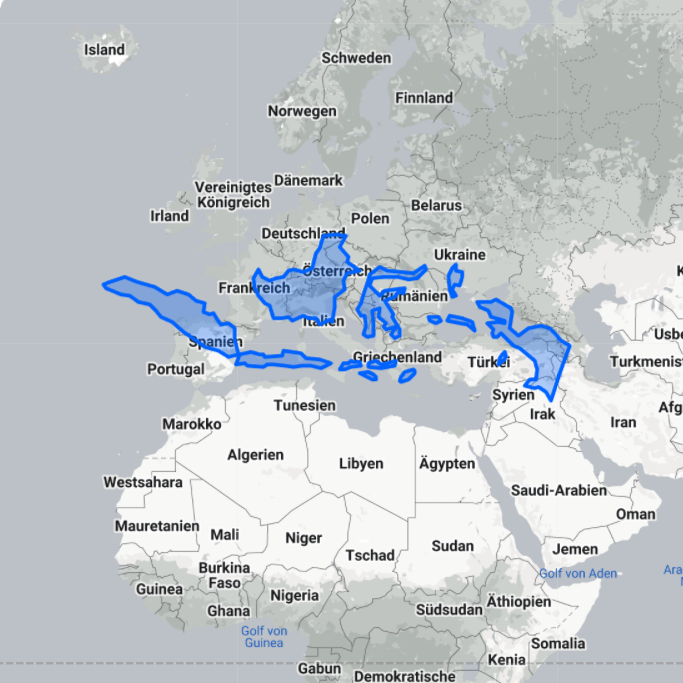
The true size of a country?
What is the true size of countries compared to each other? Due to the fact, that we draw the surface of a spherical earth on 2D-plane we have distortions. The typically used projection, the definition how the sphere is drawn on the 2D-plane, is Pseudo-Mercator which inherits a large distortion in area and distance towards the poles. Therefore countries, which are closer to the equator are displayed far smaller than on the poles.
A great example is Indonesia. It stretches over whole Europe if you move it. Another great example is Greenland. It looks similar in size to South America, but it's 9 times smaller.
You can try it by yourself: The true size of...
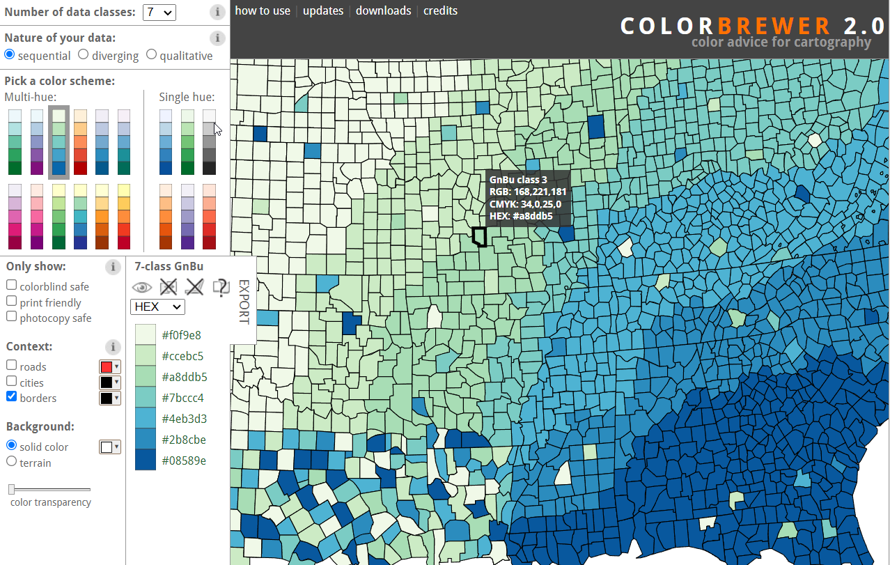
Color Brewer 2.0
The Color Brewer is a beautiful tool to quickly generate color schemes for maps. It offers all three basic schemes:
- Sequential, for rankable categories
- Diverging, for rankable cateogries with a meaningful middle
- Qualitative, for nominal data which is not rankable
You can try it by yourself: Color Brewer 2.0
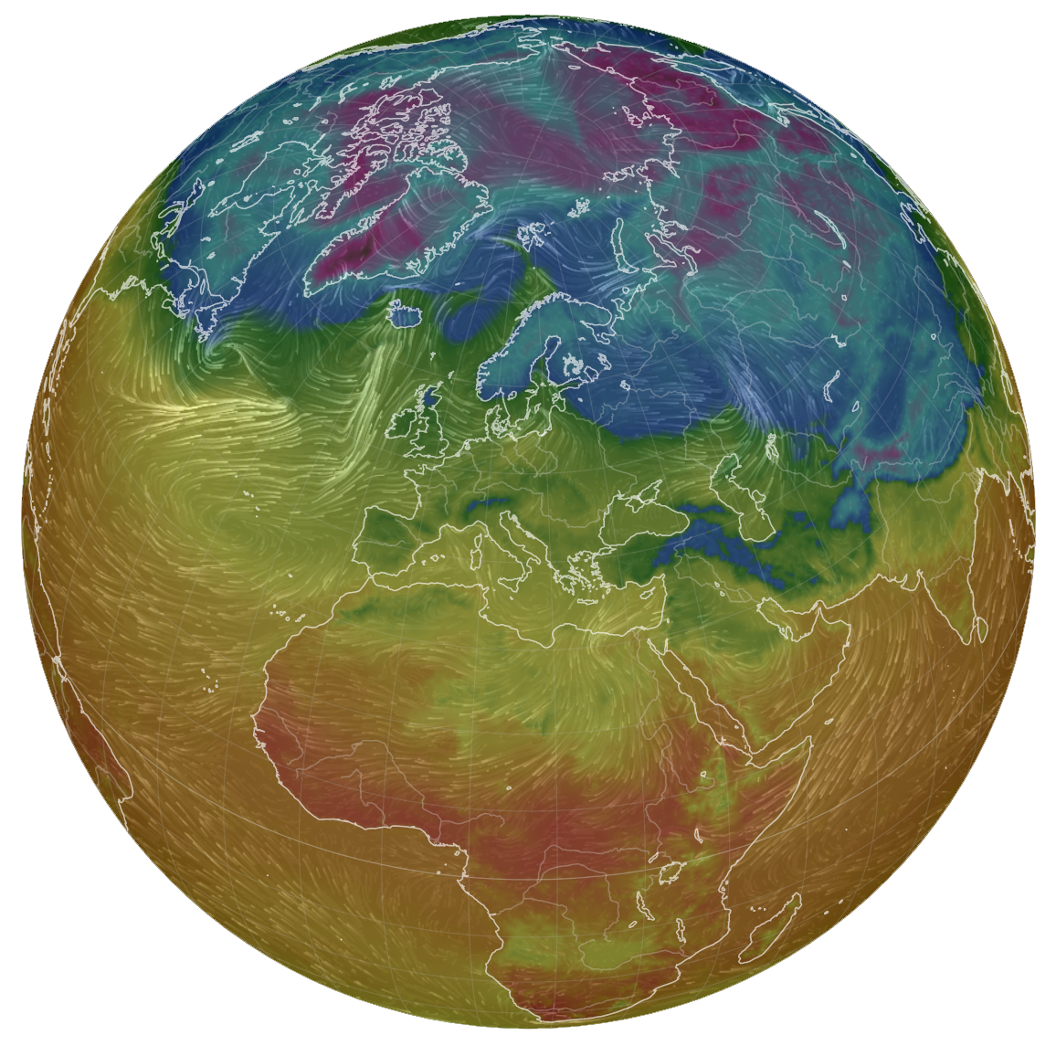
What is the current weather on the other side of the globe?
Cameron Beccario created this animated visualization in 2011. It is fed with the current weather by several sources and provides many differen layers like wind, temperature, ultraviolet index, pressure, sea surface temperature, green house gas concentrations and many more.
You can try it by yourself: earth.nullschool.net